


With a clear goal and target audience in mind, we led brand workshops with internal leaders, team members, construction firms, and architects. This process uncovered key insights that informed the brand promise, messaging, and positioning of the new urgent care concept. Working alongside the architects and construction team, we ensured the space itself reflected these strategic choices—translating the brand values into design decisions and functional touchpoints. The new urgent care environment became an extension of the brand, reinforcing trust, accessibility, and innovation at every step of the consumer journey.
Because outdoor enthusiasts of the Pacific Northwest have a strong connection to their natural surroundings, the new urgent care branding effort reflected the essence of this vibrant and distinctive region. We named the clinics Indigo, a deep, rich color that’s reflective of the sky, ocean, and distant mountain peaks.
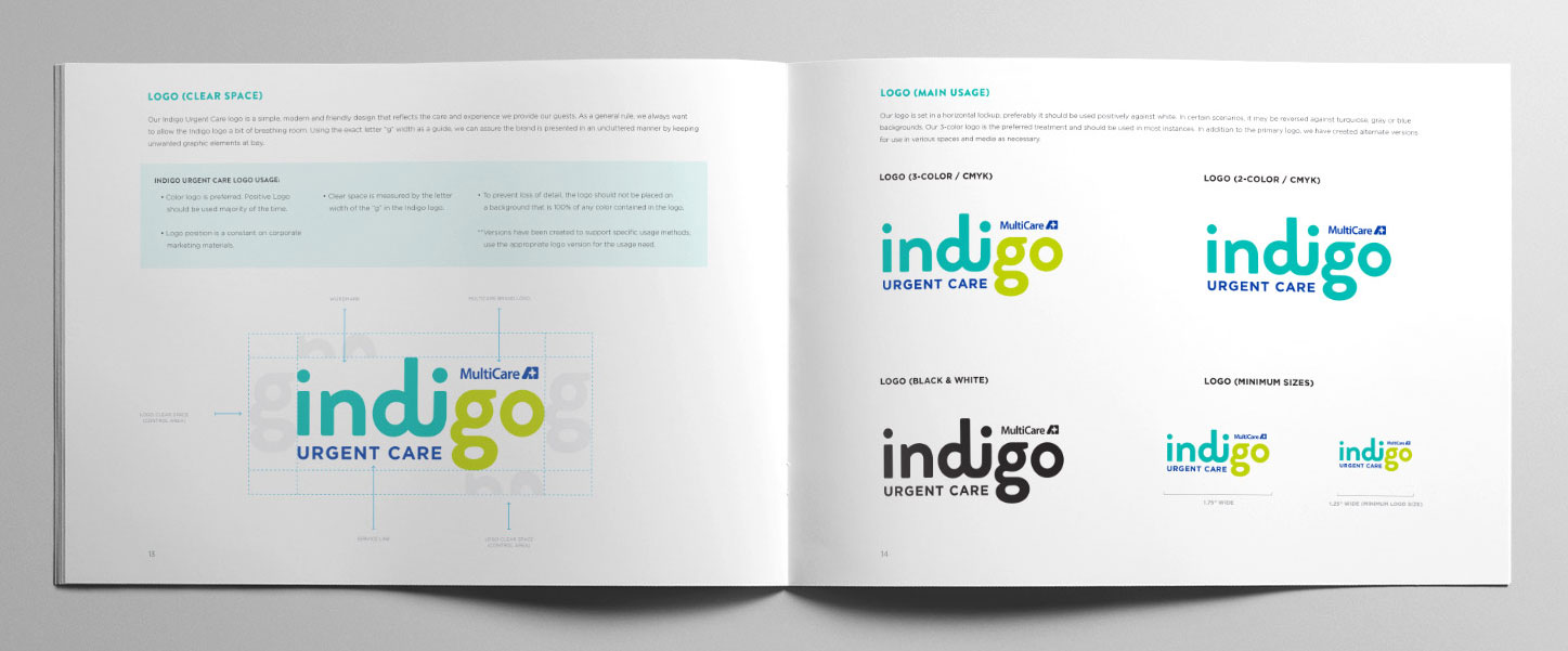
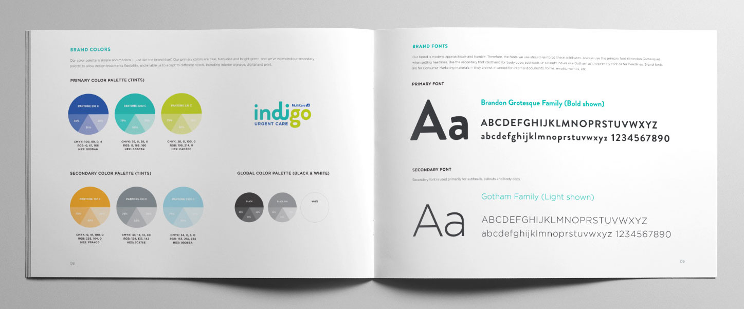
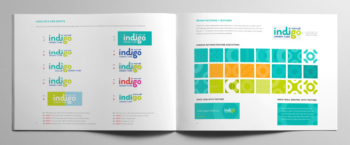
Indigo also stands for “individuals on the go,” making it a compelling and relatable urgent care brand name consumers can readily recognize and embrace. We kept the primary indigo colors very bright, friendly, and modern, artfully anchoring them with the MultiCare parent logo. The word “go” from “indigo” was highlighted in green, symbolizing a green light on the path to more personalized care.
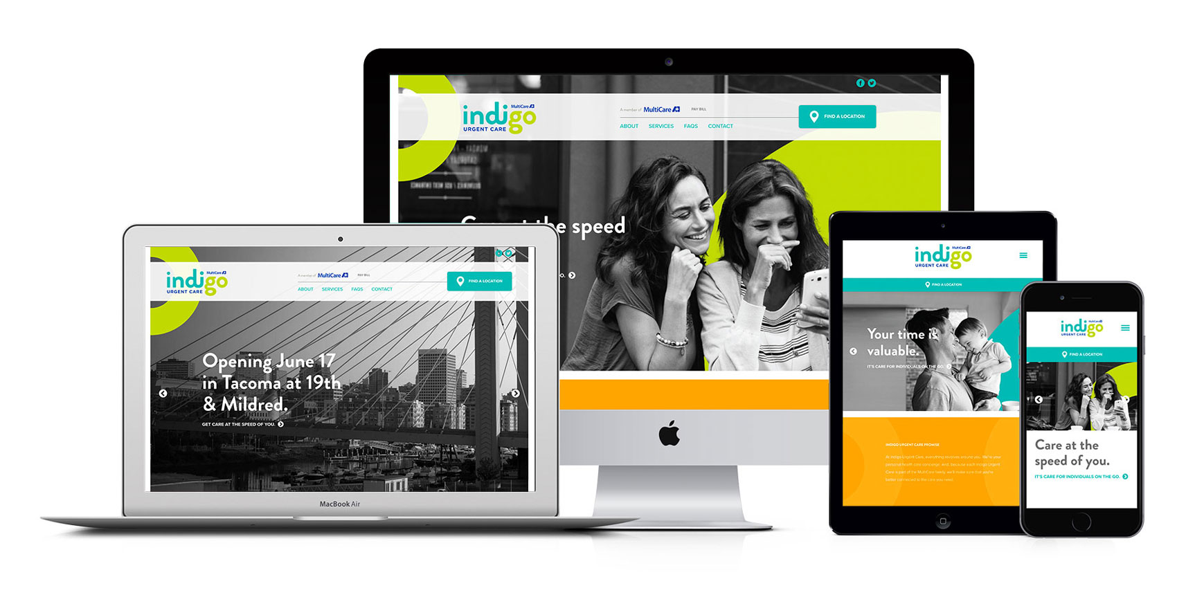
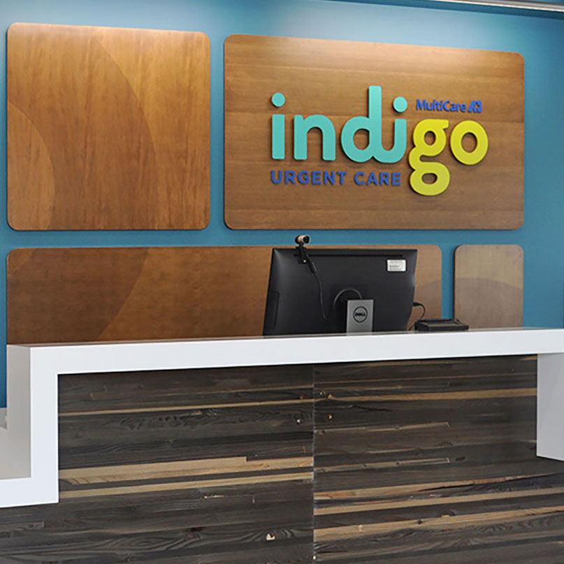
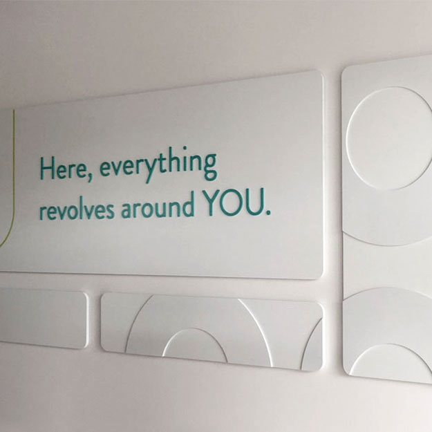
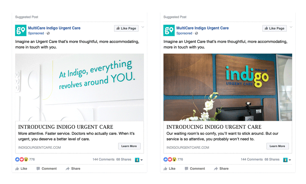
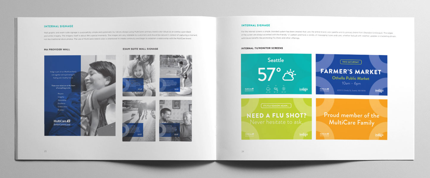
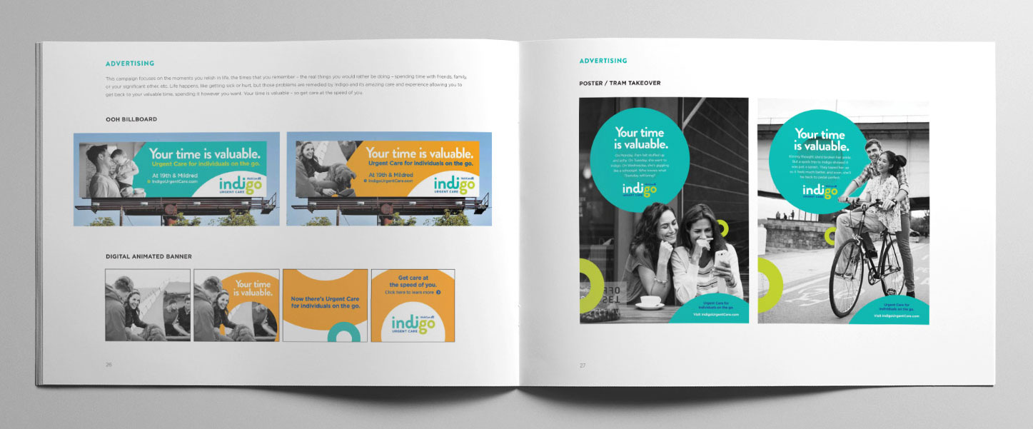
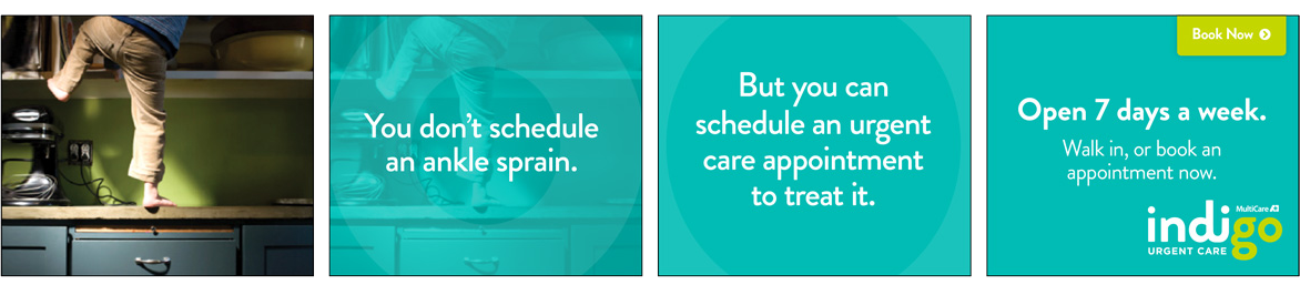
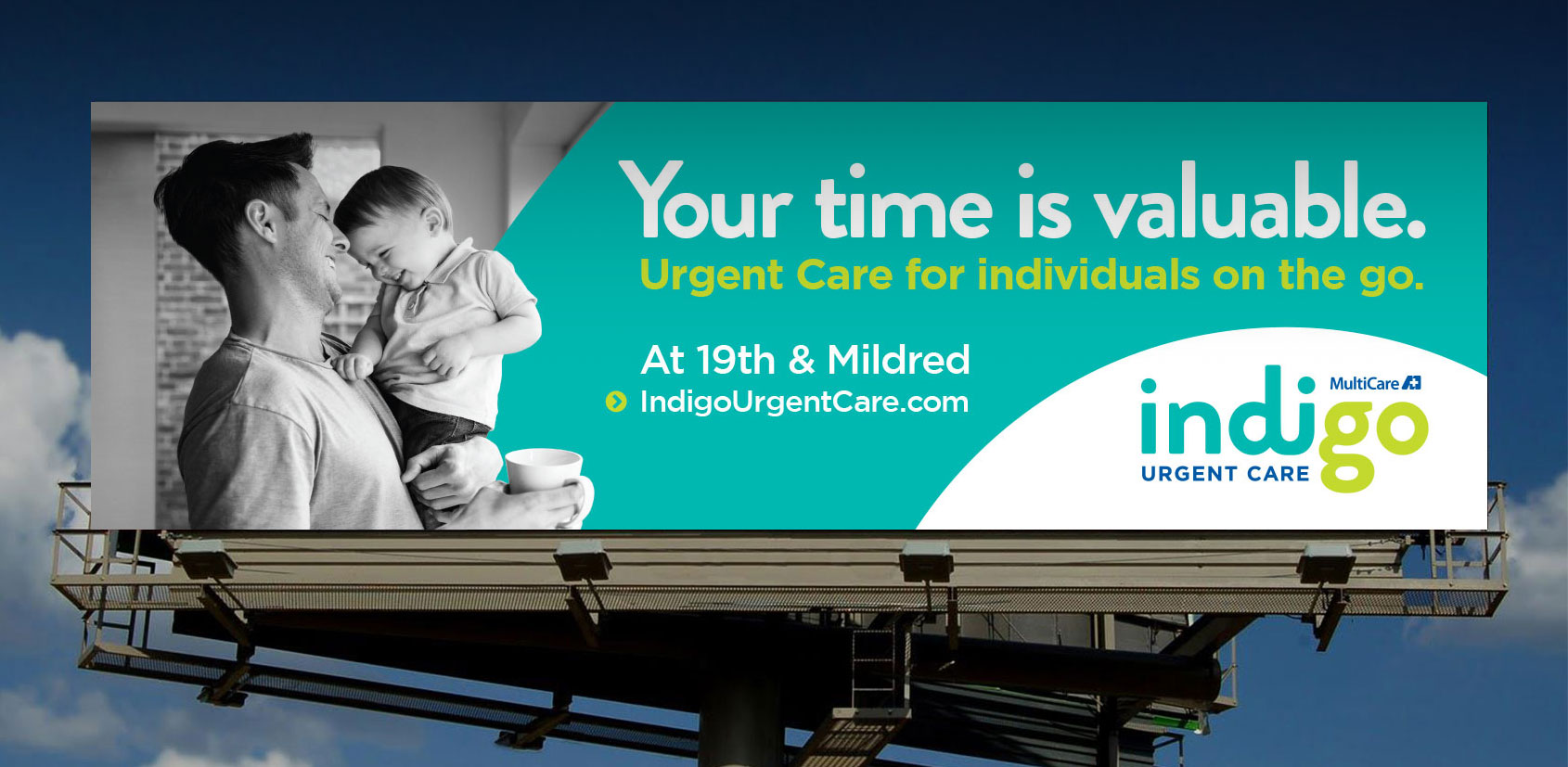
Warm and inviting clinic messaging welcomed visitors and wood design elements infused an outdoor aesthetic throughout the clinic design and construction. Creative included outdoor, transit signage, and online video to create awareness and buzz along with a user-friendly, fully responsive website. In the end, we set out to create a new urgent experience that invited full brand immersion, introducing Indigo to the Pacific Northwest with the promise of delivering exceptional care in an exceptional way.